
Sections and layout
layout: is a list of sections, top to bottom. Each section holds widgets and says how to draw them. The full list of options is in the reference.
layout: - title: Now columns: 2 widgets: [plex.streams, downloads.active] - title: Services variant: minimal header: false favorites: [Plex, Home Assistant] widgets: [services.status]Display
Section titled “Display”display picks how a section draws its widgets.
| Value | What you get |
|---|---|
cards | Full cards. The default. |
tiles | Headline tiles with live graphs. |
rings | The same headlines as ring gauges, coloured by health. |
media | Every item of the section’s media cards as artwork tiles in one grid. |
Tiles and rings need a card with a summary or summaries.
How cards are arranged
Section titled “How cards are arranged”With no other instructions, Valet picks an arrangement from what’s in the section:
- Any widget has a size other than medium. A bento grid of 2, 4 or 6 columns. Rows end flush.
columnsis set. That many cards per row, from tablet width up. A number is 1 to 4. For per-screen control, use an object, up to 6:{ phone: 1, tablet: 2, desktop: 3 }.- A card marks itself wide. It takes two thirds, and the rest stack beside it, unless
columnsis set. - More than three cards. They pack into columns, with compact rows.
- Otherwise. They share a row and a height.
gap sets the pixels between a section’s cards. tabColumns sets different columns on the section’s own tab.
Density and titles
Section titled “Density and titles”| Option | What it does |
|---|---|
variant: minimal | Tighter rows with the essentials. For a status card: icon, name, dot. |
header: false | Cards in the section drop their title bar on the overview. |
heading: false | No title above the section. It still names its tab. |
Favourites
Section titled “Favourites”A long status card can show only what matters on the overview:
- title: Services favorites: [Plex, Home Assistant, Immich] widgets: [services.status]It shows those names, and whatever’s down, with a link to the whole list on the section’s tab.
Sidebars
Section titled “Sidebars”place: left or place: right makes a section a sidebar on wide screens. columns then sets how many columns its list uses. Sizes don’t apply in a sidebar.
- title: Services place: right variant: minimal widgets: [services.status]The hero
Section titled “The hero”The top of the overview: the title, a status line, the ask box. hero: controls each part.
greeting: Samhero: { greeting: "Welcome back, {name}", align: left, review: false }The title is “Sam’s homelab” until you say otherwise. hero.greeting replaces it: {name} is your greeting, and {greeting} is the time of day, as in "{greeting}, {name}".
status is one sentence under the title, two things at most: “All 30 services are running and Sam is watching Dune.” or “Everything’s running except Mealie.” What needs someone comes first, and services off by choice aren’t counted. With an assistant, hover it for the brief.
search is the ask box, or a search box when there’s no assistant. review is the year in review link, on its own line under the suggested questions. You can dismiss it for the visit,. review: end also closes the overview with a card, and false drops both.
The menubar
Section titled “The menubar”Small rings in the top bar, one for each headline number. Hover one for its live graph.
menubar: [system.tiles, dns.stats]weather: weather.now # a ring beside the clockcalendar: family.agenda # events when you hover the clockUse the object form for more: position, labels, clock, date, theme and size.
Live activities
Section titled “Live activities”What’s playing, what’s downloading, the vacuum, an event in progress. They’re rings in the top bar, in the same plate as the menubar’s, to their left with a thin divider. Artwork inside, progress around.
Hover or tap one for the story, like every other ring. On phones they share the top row, up to two of them, and the clock steps aside to make room. When nothing is live, they’re not there.

live: activities: [plex.streams, downloads.active, home.house] notify: - { widget: downloads.active, on: end, text: "{title} finished downloading" } - { widget: services.status, on: down, push: true }List widgets in order of importance. notify shows a short toast at the bottom of the page on start, end, down or up, and the widget must be placed on the page. push: true also sends it to your notification channels.
The palette
Section titled “The palette”Ctrl+K (⌘K on a Mac) opens search and actions from anywhere. Set search: to add web search.
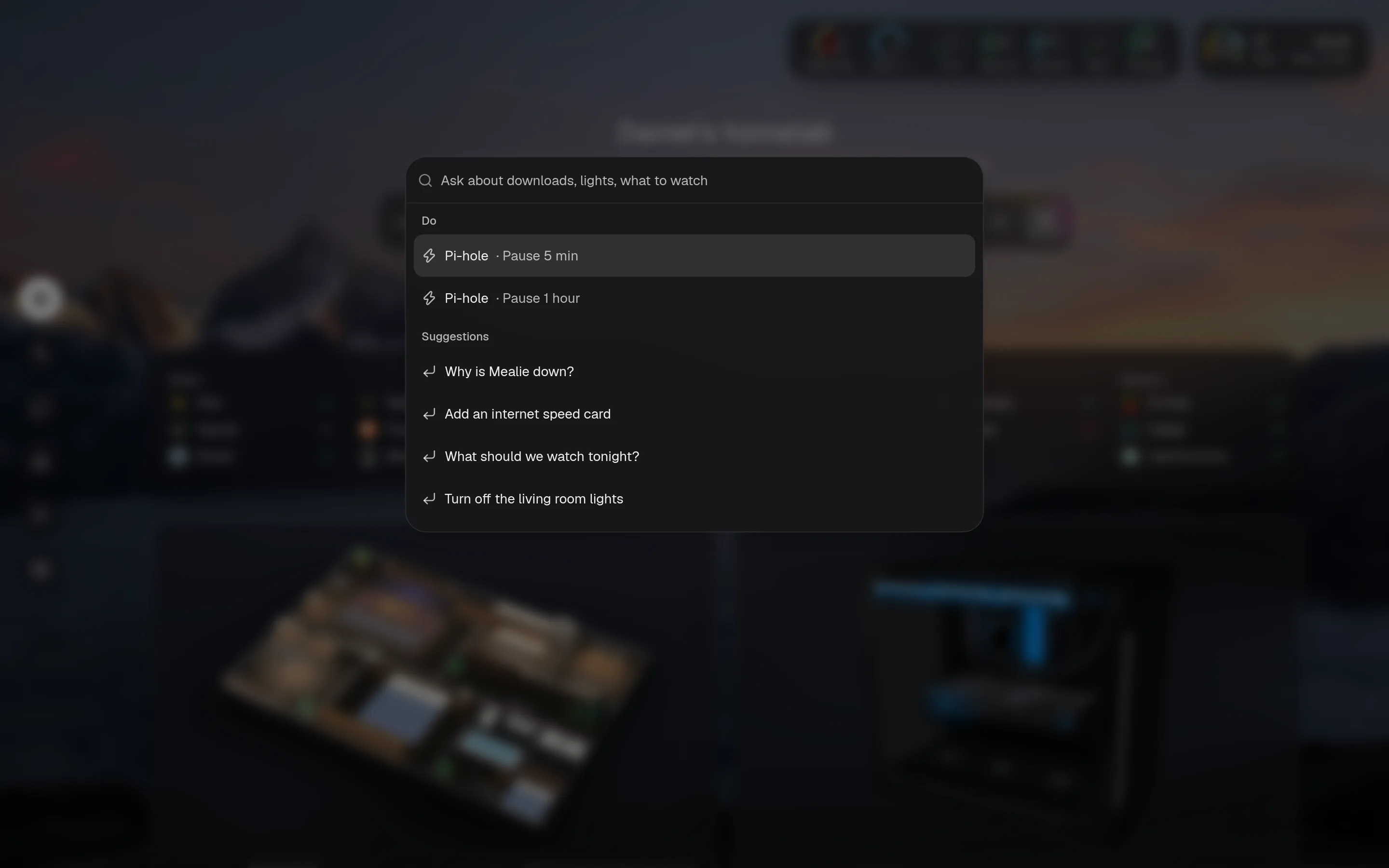
search: duckduckgo # also google, kagi, brave, startpage, searxng, or a URL with {q}