
Controls card
Switches, sliders, choices and buttons. Each control names an action on the same integration.
Variations
Section titled “Variations”1 sample, each at every size that draws differently, then in chat, in the light theme, and as a ring where it has a headline.
controls
Section titled “controls”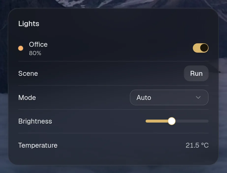
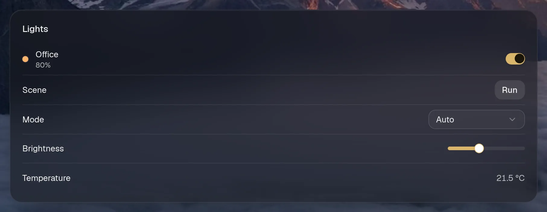
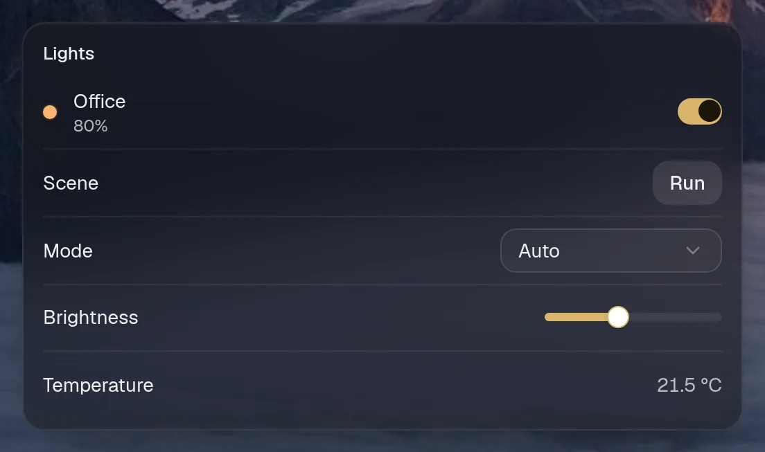
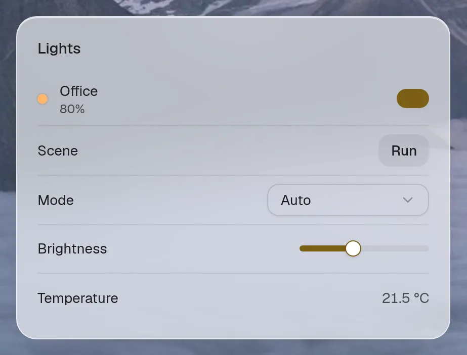
Small draws the same as medium. Wide draws the same as medium. Tall draws the same as medium, so they aren't shown. Only the empty space changes.
Fields
Section titled “Fields”Every card also takes the fields all cards share.
| Field | Type | What it does |
|---|---|---|
type | 'controls' | |
items | Control[] |
Control
Section titled “Control”| Field | Type | What it does |
|---|---|---|
id | string | |
label | string | |
kind | 'toggle' | 'slider' | 'select' | 'button' | 'value' | value: read-only, e.g. a sensor reading |
value? | boolean | number | string | |
options? | string[] | |
min? | number | |
max? | number | |
step? | number | |
color? | string | swatch, e.g. a light’s current colour |
action? | string | action name on the same integration instance (not needed for ‘value’) |
sub? | string | second line under the label, e.g. “Office · 80%” |
args? | Record<string, unknown> |